The sad truth of life, sometimes, is that some emails don’t, in fact, "find us well".
Emails, especially work emails, are the bane of most people’s existence and the latest focus of internet memes. Ever since 2020 when the pandemic hit, staying in touch digitally has played a bigger, more important role in the workspace than it ever had before — and emails have become integral to functioning.
Although they have managed to get a little smarter, what with auto-suggested replies, filters and rules, and giving people more tools to customise their inboxes, the format hasn’t really changed a whole lot.
The basic UI/UX has steadily remained the same — nothing concrete has changed there.
And it’s understandable why the likes of Microsoft, Google, Yahoo and other email services providers haven’t bothered revamping the communication window format. I mean, if it ain’t broke, why fix it?
The thing is though that traditional emails are seeing competition from the likes of WhatsApp, Telegram, and Slack, especially in the workplace where most of us tend to rely on emails more heavily. That is not to say emails are going away any time soon — but maybe it’s time to reinvent the traditional inbox layout to make it more conversational.
Spike is trying to change that — and its take on conversationalising email flow is quite interesting. The app is available on Android and iOS, both. On the Google Play Store, it has a 4.2 out of 5-star rating, and five lakh-plus downloads.
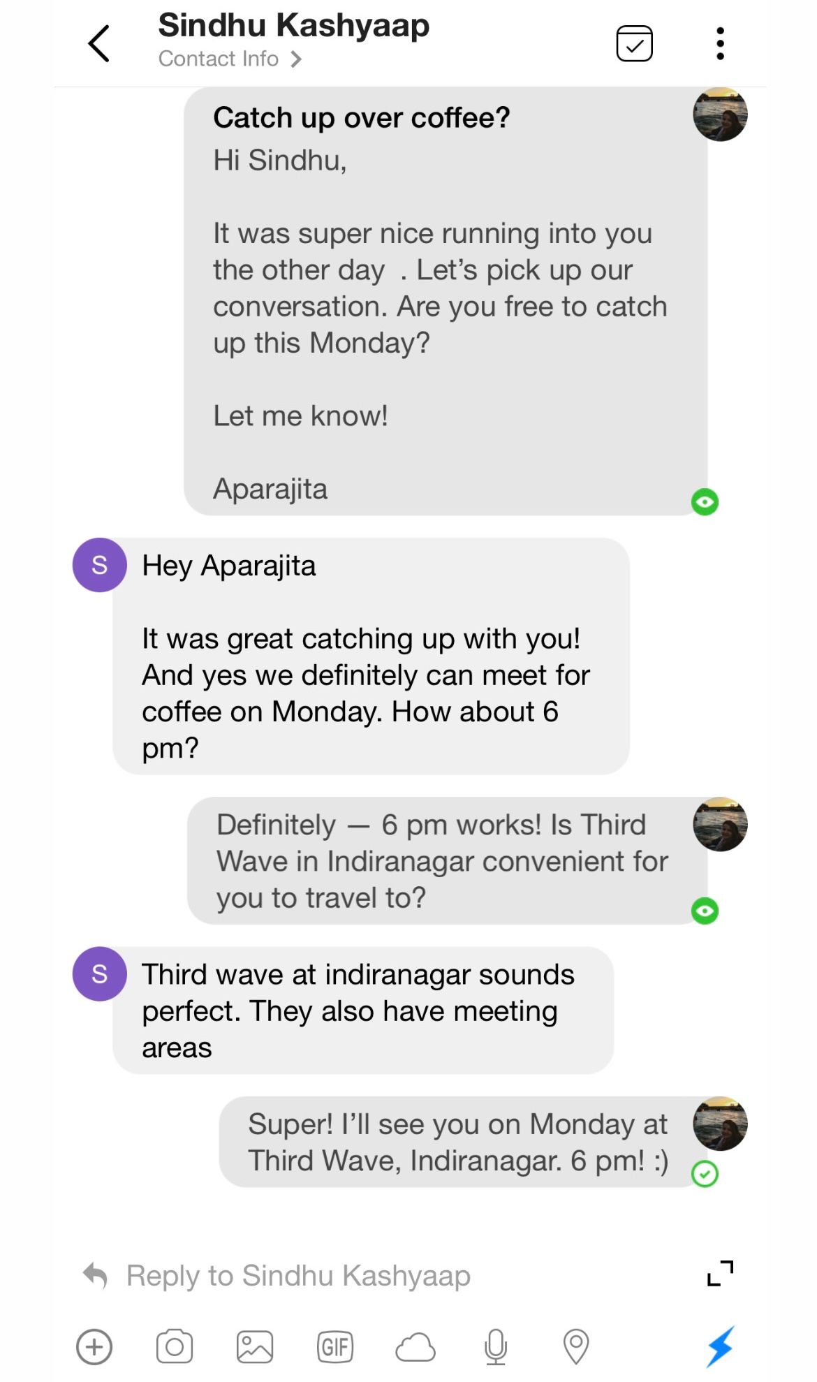
What it essentially does is turn an email back and forth into a text message-type layout, which makes it so much easier to deal with them, as well as keep track of the conversation much more easily versus the traditional way.

Representational Image
Signing up is easy — you simply log into your email account from within the app. The app is free to use if you’re plugging in your personal email — and you can plug in unlimited personal emails on the app.
For work emails, however, there’s a 14-day trial period, after which you’ll need to shell out Rs 606, or $8, per month. Students can use Spike for free with their university email IDs.
The app also allows one to create notes, to-do lists, working groups with friends — essentially like a Slack, but on email — and declutter the inbox.
Our experience using the app
I tested the app out with my work email because that's where I spend most of my time, versus my personal email account.
There are several noteworthy features on the app that are truly useful:
- The conversation flow: Spike turned my email back and forths — and there were many email back and forths — into a really neat, WhatsApp-like format, which made it infinitely easier to respond to incoming mail, and, more importantly, keep track of the conversation without having to go through the entire thread again.
It’s hard to put into words how efficient this makes emailing, but I’m going to try. As a journalist, I’m corresponding with at least eight to 10 people on any given day, whether it’s following up on a story or setting up a call. In the midst of all of that, I get some 15-20 PR pitches, which bury the conversations I’d been having — and I often have to rely on my ‘sent’ inbox to fish out those emails.
Where Spike made a difference was it made it easier for me to see the conversations I had been having — emails I had responded to or reacted to. And that helped me track the conversations I’d been in the midst of much faster than I normally would have on the usual interface.

- The notetaking feature: I instantly loved this feature because I like to keep a note-to-self + to-do list handy to track all the projects I’m involved in. Usually, I use the built-in macOS notes app, or a physical notepad — but it’s easy to lose track of these, and I have to keep switching between applications to update my notes.
Spike’s in-built email notetaking feature, however, is cutting-edge and makes it so much easier to quickly make notations from within the app, without having to ever leave the platform.
Spike truly revolutionises your email inbox — but there are issues with the app, some quite glaring and unnerving.
To begin with, there’s quite a bit of a learning curve when you initially log in. The UI is super busy and there’s a lot to get used to — which is fine, and essentially just a question of giving yourself some time to get used to the interface.
What really bothered me was the way it organised my inbox.
For some reason, my latest emails kept getting pushed lower or sorted into the “other” folder — and after putting the app through the paces for around two weeks, I’ve still not figured out the rationale behind the sorting.
Secondly, I noticed that some emails took really long to deliver and receive, even if they were just textual emails, without any attachments or photos. This was quite concerning because I began to worry I was missing important emails. Sometimes, calendar invites failed to show up in my inbox.
Noteworthy though that Spike managed to retain all 18 of my “filtered” inboxes which I’d set up using the rules functionality on Gmail — which is something I’ve not seen a lot of email client applications do as well as Spike did.
Still, the thrill of having my rules apply to my Spike inbox was replaced soon by annoyance when I realised the app was using my signature/sign off space to advertise itself, without my permission. Apparently, this can be disabled from within the app somewhere, but it wasn’t easy to locate that option given how many options and things there are on Spike’s busy platform.

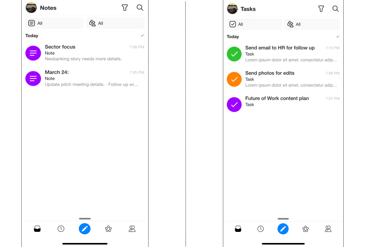
What the 'notes' and 'task' interface look like on Spike
Several times, the app froze in the middle of me composing an email or responding to one, or if I selected multiple emails to delete, it would randomly quit. The glitches got in the way of the superior experience one can definitely get out of Spike if it worked well — and that left a bad taste in my mouth.
Verdict
The conversational messaging feature is amazing and it’s hard to imagine any other way to truly rejig the inbox format in any other way but this. However, the few glitches I faced put me off the app, and I found myself going back to the native Gmail app to track my emails.
Still, the messaging feature was really fun to use, and I did prefer the app over Gmail when I had to go back to email threads that had a lot of back and forth.
The cost doesn’t justify it for me though.
By Indian standards, Rs 600 is on the higher side, and I’d rather use Telegram or WhatsApp or even Gmail to keep on top of my mails and correspondences. Added to that is the fact that I sort of lost faith in the app to get me my emails on time, or even organise it properly enough for me to notice my recent emails — so, for work purposes, Spike doesn’t cut it for me.
For personal emails, a free feature on the app, I’d be willing to give it a go. But considering my personal inbox isn’t something that sees high activity, for me at least, I’d rather stick with the native Gmail app.

All in all, I’d wait for the app to either lower its price point, or at least simplify its interface and squash all its bugs before subscribing.
But if you are willing to pay and looking for something to help you manage your emails better, Spike is definitely one of the better email client platforms out there.
Edited by Teja Lele Desai


