The problem with having a formula that works is that everyone starts using it so much that it becomes hard to distinguish one from the other. Think of websites, apps, or platforms that have stood out for you recently in terms of design, and you will notice how similar their design language is — minimalistic, some cutesy human figures, random emojis in the text, the colour blue in pastel, sans serif font, and clean interface.
As someone who loves using multiple fintech apps, I probably wouldn’t be able to tell one neobanking platform from another even at gunpoint — simply on the basis of design elements.
When we compare apps like Fi and NiyoX, which we’re reviewing today, you will see how similar they are in terms of design — albeit functionality is a whole different ball game.
It’s the little things — design elements, as this diatribe clearly points to — that make using one app more delightful than using another, especially since the basic services offered are almost the same.
Moving on.
NiyoX is ' online consumer banking platform that allows users to quickly open a bank account with a few clicks. NiyoX works with Equitas Small Finance Bank — so when you sign up for an account on NiyoX, your bank account will be with Equitas. NiyoX is just the tech layer on the top, which is a model every single neobanking platform today follows.
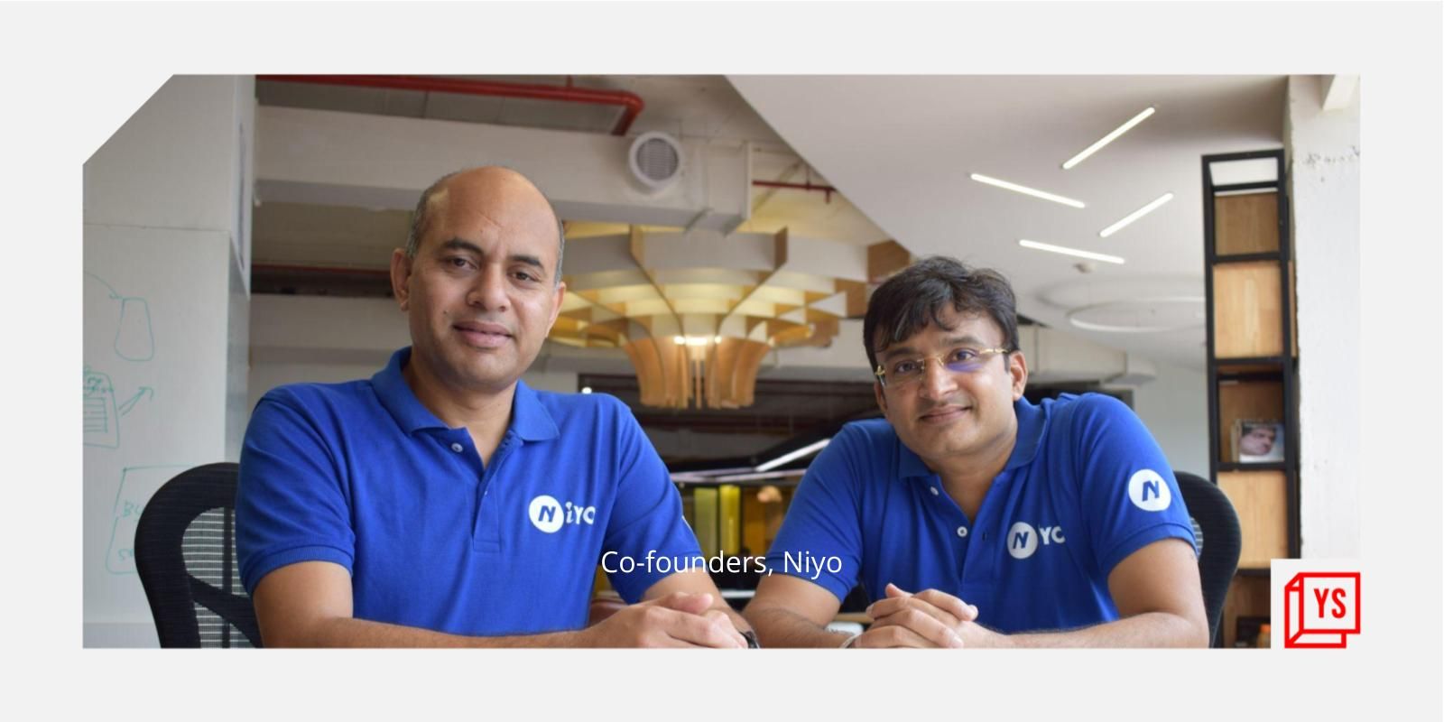
Bengaluru-headquartered Finnew Solutions, which owns and operates consumer-facing fintech startup Niyo, was founded in 2015 by banking executives Virender and Vinay Bagri. It has raised $150 million in funding so far from the likes of Accel, Light Rock India, Venture Catalysts-backed Beams Fintech Fund, Prime Venture Partners, and JS Capital, among others.

Niyo has three primary products:
1. NiyoX — its neobanking platform
2. Niyo Global — forex banking platform that offers 0 percent markup in foreign exchange rates
3. Niyo Money — wealth management app that allows users to invest in mutual funds and other financial products
NiyoX is the startup’s most-used product and has seen traction, particularly from millennials. In fact, the startup, in the first 150 days of its launch, said it had onboarded five lakh customers — a new user almost every 30 seconds.
The NiyoX app is available on both Android and iOS. On the Google Play Store, it has seen over a million installs, and has received a 3 out of 5-star rating.
Experience using the app
As with any neobanking app, the sign up involves inputting personal information and identification details — all part of the basic KYC one needs to do to open any banking account, online or offline.
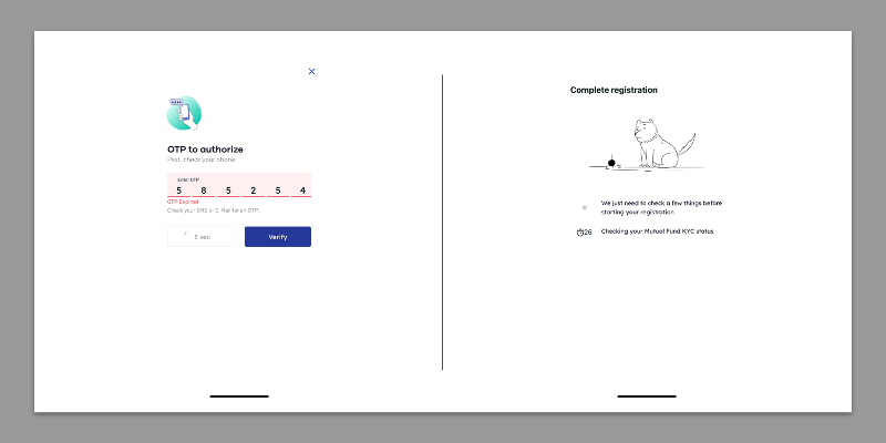
The first snag we hit came after the KYC capturing was done. The wait screen, when NiyoX verifies your KYC details and creates an account, flashed for nearly 10 minutes, after which I decided to reopen the app.
It still didn't work.
When you re-login to the app the first few times, it generates an OTP that gets sent to your email ID and mobile number.
For some reason, NiyoX’s OTPs — not just on the login screen — take ages to arrive, and if you hit “resend OTP”, the first, original OTP, that arrives after a good five minutes, becomes invalid. Which means you have to wait another couple of minutes before you get the current OTP.
The good ole days of trying to log in to COWIN came to my mind, which was triggering, to say the least — and this OTP issue persists throughout the different aspects of the app, such as when trying to unlock/lock your virtual card.

Grappling with OTPs and long wait times
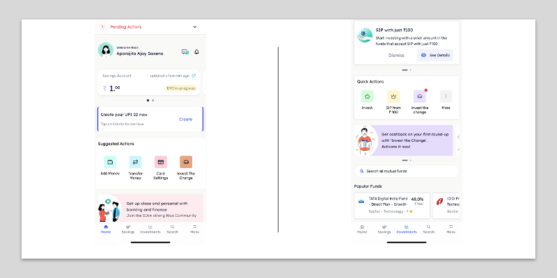
After some amount of grappling with modern technology, you land on the main home page, which is quite aesthetically pleasing. You can find almost all the basic functionality buttons in one place, without having to even scroll through. There’s a very helpful “pending actions” bar right on top of the app, which is good for tracking your sign up and the progress of your KYC verification.
A few features worth calling out on NiyoX:
1. The app offers market-beating interest rates of 7 percent on savings account, which it calls out in several places — but that’s only for savings of Rs 5 lakh and upwards. Up to Rs 1 lakh, it offers an interest of 3.5 percent, which is on par with most other banks.
2. NiyoX integrates Niyo Money, its wealth management offering, on the same platform, and allows you to track your savings and investments on the same platform, which is a feature I haven’t seen being offered on one platform, so far. Fi, NiyoX’s competitor and an app we recently reviewed, does not offer mutual fund investments yet.
3. The spare change investing feature is superb on NiyoX, mostly because, unlike other platforms including Fi which locks that spare change up in a fixed deposit, Niyo allows you to invest it in a mutual fund.
For a chunk of change to turn into actual, usable money, faster than what it would have had it been in a fixed deposit, is really useful. And yes, apps that specifically enable that do exist — but Niyo offers this feature from within the saving account ecosystem, which means you don’t need two separate apps! This is a feature definitely worth exploiting to partially rid yourself of the guilt that comes with purchasing sheet masks you don’t need on Amazon.
The app, on the whole, is smooth.

Again, no standouts when it comes to design, but functionality-wise - or at least what it's trying to achieve - it’s wholesome. You can see all your credits and debits easily, and don’t have to flounder about on the platform to easily access other options.
The search feature could be better, especially when compared to Fi’s superb search tool that presents your transaction history using any filter you want (such as ‘transactions under Rs 500’).
Signing up for the investment and wealth management service was truly a hassle. The app asks you to e-verify/e-sign the final KYC document to open your demat account on the NSDL portal — after which, for some reason, it directed me to Equitas' banking portal where it asked for login details to Equitas’ website!
NiyoX, functioning as a layer of tech over Equitas, shouldn’t be directing users to the bank's website, because otherwise what is the difference between signing up directly with the bank, and using a neobanking app?
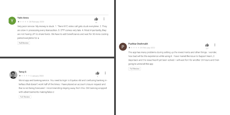
It’s also worth noting that NiyoX’s Google Play Store review page is inundated with less than favourable reviews — including a few where people said it was difficult for them to close their savings account with Equitas when they wanted to opt out, signing up for the investment service was an unnecessarily stressful process, OTPs took too long, no response from the team for a full KYC, and even being asked to visit a physical Equitas branch for verification.

Some reviews from Google Play Store
Our final verdict is that, while NiyoX has its heart in the right place and the combined savings + investment feature is sure to be a hit, its infrastructure needs some serious TLC and even an overhaul of sorts. It also needs to let users opt out and shutter their bank accounts more easily, without having to use Equitas’ netbanking interface as many pointed out they were asked to do, or even visit the physical branch.
Maybe waiting and seeing how this app develops is the way to go, for now.
Edited by Megha Reddy


