A picture is worth a thousand words, but what if you can gain knowledge just by swiping and scrolling pictures like on Instagram? Inspired by the concept, Bengaluru-based Edubite Technologies Pvt Ltd developed Yoda, an app that brings interesting and informative content through visuals.
Launched in December 2020 by Vineet Chirania, Amit Bansal, Amit Mishra, and Kanishk Mehta, Yoda offers a knowledge-sharing visual platform that enables users to exchange images and infographics across categories such as entrepreneurship, technology, marketing, history, science, mathematics, business, geography, etc. Recently, the app got selected by Google for Startups Accelerator (GFSA) for its fifth cohort in India, for providing learning within 20 seconds.

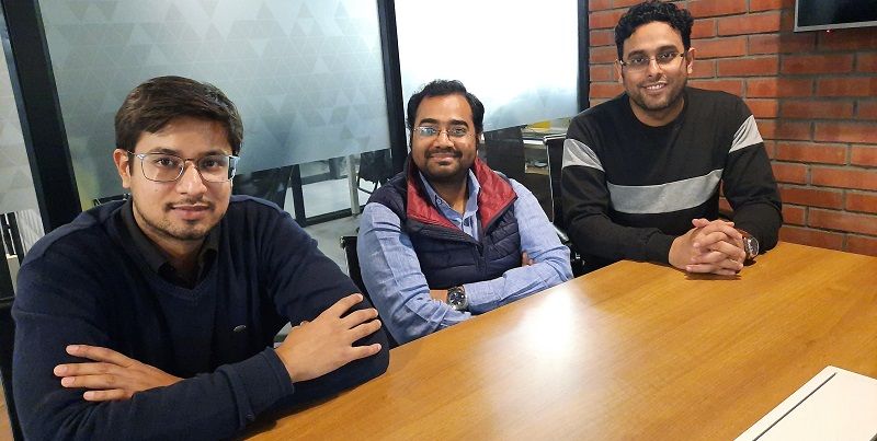
Yoda App founders
Coined on the character of a Jedi Master in the Star Wars films, Yoda is claimed to be derived from the Sanskrit word ‘yoddha’ meaning ‘warrior’, or the Hebrew word ‘yodea’ meaning "one who knows" — pointing to how the app aims to serve as a knowledge hub.
Since its launch, the app has been downloaded more than 100,000 times and has a rating of 4.3 on Google Play Store. The app is yet to be rolled out on iOS.For this week’s app review, we decided to walk through the app and find out what we can learn from Yoda.
Let’s get started
To start using the app, one can either sign up on the app via Gmail ID or can even browse as a guest. We continued as a ‘guest’.
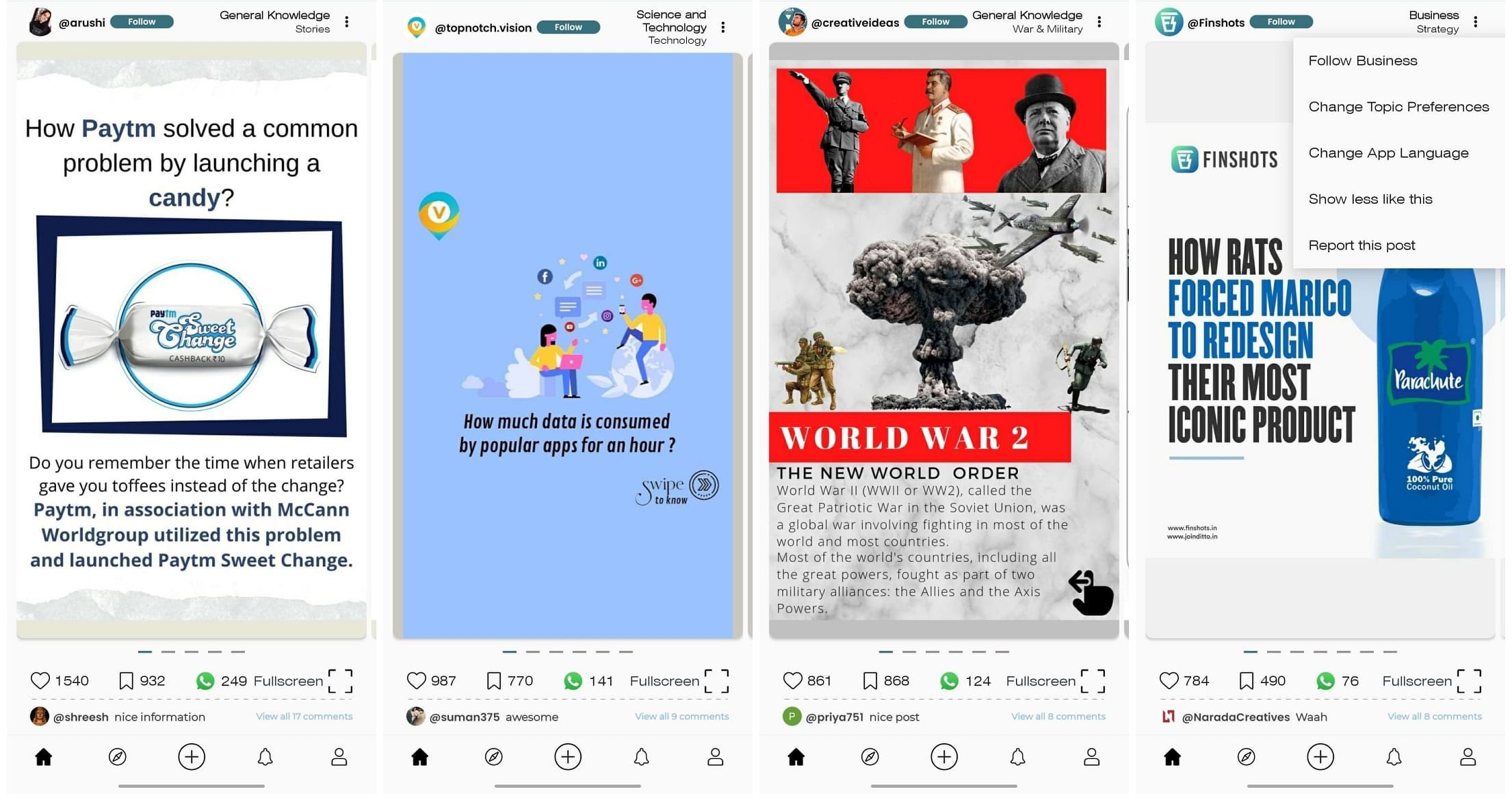
Straightaway, the home screen started flashing information through card-like features, which act as a social media story. Users can read some text on one card and swipe right for more information about the same. And if you want to read something else, then you swipe up for more image-based lessons.
The experience is very similar to browsing Instagram.
The content
The app has a vast variety of content – ranging from mythology to personal finance, psychology, culture, lifestyle, general knowledge, science and technology, astrology, technology, history, geography, politics, business, entertainment, mathematics etc.
We found information on the app easy to understand due to bite-size posts. The information is posted by creators. The app would have come across as more authentic if the content was posted in a uniform format, but since it is posted or curated by different people, it is presented differently.
In terms of the authenticity of the information, the app makers claim that information or content on the app is authentic, and is fact-checked and approved manually by an expert team at Yoda before it reaches out to the users. However, even though YourStory cannot verify the claim, the app has users or content from the likes of news sites and content creation platforms such as Inshorts and Finology as well.

The content on the app is available in both English and Hindi, and to switch between these two languages, all you have to do is click on the three dots on the top right corner for options. Other than the language, you can also change topic preferences, follow a particular topic, or search for a graphic.
These features make the app very easy to use and minimalistic. Besides this, the infographics, or the picture-based information, can be liked, saved and shared on other platforms like WhatsApp, and the user can also follow the creator if they like their content.
Create infobites
If you think you have something informative to tell the world, you can become a creator on Yoda by signing up and creating an account. All you have to do is press the ‘plus’ sign below on the home screen, and the app shows you a picture with information on how to create a post.
To create your own post, you have to design a JPEG or PNG image with dimensions of 1000 (width) X 1600 (height) pixels, which you can create on Canva, Photoshop or PowerPoint. However, Yoda doesn’t provide the tools to design a post on the app itself.
You can then save the images on your phone, and upload it. Your bites are best viewed in a 5:8 aspect ratio. The app suggests keeping your post to the point, less flashy, and fact-based.
The verdict
With crisp and bite-sized information that is available on a single screen, the Yoda app can be really helpful for busy millennials who would like to acquire knowledge in a limited amount of time. The app is well suited for users who don't have the patience to read long-format articles. It's like a quick, easy-to-consume capsule of knowledge with a creative and engaging interface.
The app makers seem to have recognised the dwindling attention span among the next-gen users, and have offered a nice solution to consume reliable bite-sized information. Yoda is capable of conveying the information in a single-screen infographic and helps digitally connected users to stay informed and updated about the world on the go.
While the app is still less than a year old, it is still a work-in-progress. The app can function more smoothly if the makers include an in-app studio for infographics, which can have templates, to make the app content more uniform.
Besides this, we really like that it is very easy to be a content creator on the app, and unlike other short-form-video apps where you have to come on the camera, here you can just share your knowledge without using the camera.
We would definitely recommend you to scroll through Yoda.
YourStory’s flagship startup-tech and leadership conference will return virtually for its 13th edition on October 25-30, 2021. Sign up for updates on TechSparks or to express your interest in partnerships and speaker opportunities here.
For more on TechSparks 2021, click here.
Applications are now open for Tech30 2021, a list of 30 most promising tech startups from India. Apply or nominate an early-stage startup to become a Tech30 2021 startup here.
Edited by Kanishk Singh
Link : https://yourstory.com/2021/08/app-friday-yoda-learning-infographics-information-instagram
Author :- Rashi Varshney ( )
August 27, 2021 at 05:50AM
YourStory


