Designing a page that converts is never easy. There are a lot of elements to consider, and in order for the page to “work,” all of them need to come together in a powerful synergy of design and text. Not only that, but they also need to consider a specific target audience, the competition they’re up against, the latest trends in website design, and so on.
In this post, we’ll look at six design elements your startup can utilize to maximize conversions and grow.
#1 Make It Easy To Sign Up
In order to make converting that much easier, you want to provide your visitors a chance to do so as early on as possible. You can easily nudge conversions by adding a signup form above the fold.
Bear in mind that this might not work for every kind of page, and it will mostly depend on the service in question. Sometimes you just need to provide a bit more detail about the actual experience in order for someone to sign up for it.
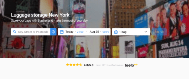
However, when it’s very easy to see what it is you are offering and what the visitor will get by signing up, adding a form in the hero section of the page can do wonders for conversions. A good example of a company doing this well is Stasher. If you look at their New York page they have a form right at the top above the fold. This makes it easy for the visitor to quickly fill out the form and become a customer of their service.
#2 Consider Your Hero
Every page that has conversions in mind should have a carefully thought-out hero section. The hero is the first thing visitors will see on a page, and it usually relies on both a powerful image and some persuasive and eloquent copy to draw visitors in.
Heroes are essentially first impressions – you only get to do it once, and you should do your very best to make that moment count.
Consider the effect you want to inspire with your hero – what emotion and what message are you looking to transmit?
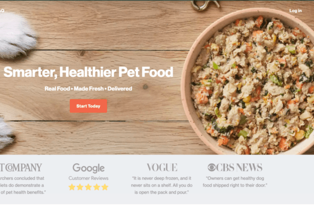
Here is a very simple example from The Farmer’s Dog – they have chosen to feature an image of their product as part of their hero, and they’ve also listed some key features: fresh dog food that can be delivered to your home. They also feature another nifty design element: social proof.
#3 Prove Your Worth
Social proof, which can come in the form of testimonials, reviews, and PR, to name a few options, is a way to show your visitors what past customers think about your brand. It works because it comes from real people, is based on real experiences, and is considered authentic and honest.
There are different ways to include social proof on your pages: you can have a section dedicated to testimonials that can take up the entire screen, you can have a small section that shows the major news outlets that you have been featured in, you can have a review section – depending on what you think your audience would like to see, you can add this feature quite easily.
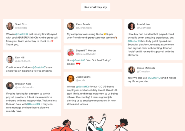
One way to feature this element can be seen in this example from Gusto – they feature a bunch of tweets mentioning their product near the bottom of the page, from real people, in their own real words. This is a great way to seal the deal, as a visitor has already read everything there is to know about the product, and now all these people are telling them it works too.
#4 Summarize Key Information
If you have a page that features all kinds of different products or services, if you are comparing different plans or options – in short, if your page is simply information-heavy, you’ll need to figure out a way to make that information easy to digest. Not everyone will have the time (or the interest) to read an entire page to get to the information they are looking for.
A great way to do that is to feature a table or a chart at the top of the page and note all of the key features there. That way, visitors can scroll further down to check for additional details, but they’ll see the main data as soon as they get to the page.
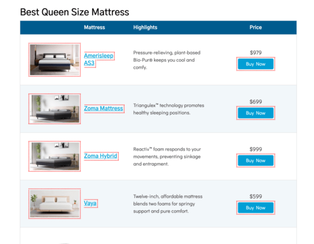
We can find a great example of this on Savvy Sleeper’s site, which has a table detailing all the most important information about each mattress they’re talking about, alongside the price and an image.
Basically plenty of information to get a reader started.
#5 Think In Terms Of Black & White
Modern website design is all about keeping pages light and airy, without cluttering them with too much information and too many design elements. This is why you should always pay a lot of attention to the way you plan to use negative (or white) space.
You may think a whole lot of white space just makes your pages look empty, but the opposite is actually true. White space draws a visitor’s attention to all the other elements you are featuring on the page: images, videos, text, animations. If everything was full to the brim, visitors wouldn’t know what to look at first.
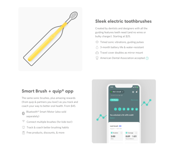
A nice example of the use of white space is Quip’s website – it’s still colorful and vibrant, but there’s just enough white on the right and left to draw your eye directly to the product and the copy that describes it in the center.
#6 Make Decision-Making Easier
Another great way to help your visitors out is to make it easier for them to make a purchasing decision. They will likely be looking at all kinds of products or services before they decide what to buy, and they want to compare all of the data they have and see what works best for them.
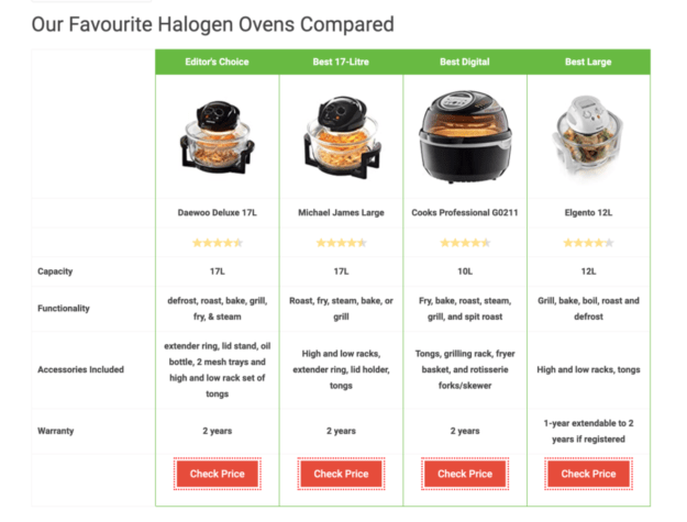
The more information they are able to get from you, the better, so something like a pros-and-cons table or chart is a great feature on a page. Make it prominent enough so that a visitor can just skim through it and understand instantly what they’re looking at.
Here is a great example of using comparison charts from Best Spy. They do this for all their review posts – so even if you don’t actually want to read the entire article, you can gauge in less than a minute what the key features of each product are, and make your decision based on that.
Final Thoughts
Designing pages that aim for higher conversion rates is often about trial and error and lots of a/b testing. You come up with an initial design, put it to the test, and the more visitors you have, the more intelligently you’re able to tweak and adjust different elements to boost your conversion rates. Try some of the suggestions above, and see how they influence your conversions.
__________
Sharing is caring!
The post 6 Design Elements Startups Should Use To Increase Conversion appeared first on StartUs Magazine.
Author: FOXYpreneur
Source : https://magazine.startus.cc/6-design-elements-startups-use-increase-conversion/
Date : 2020-09-02T04:02:38.000Z

